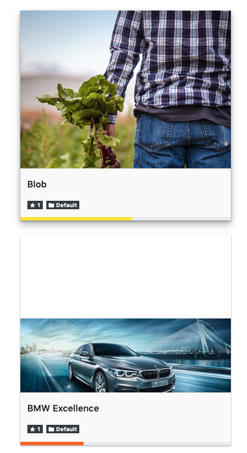
Removing the empty space around image using blur technique in CSS
Many a times, when we want to display multiple images of various aspect ratios and pixel sizes in a gallery.
In that case, there will be a single height and width of the card for the container, however the images will be of multiple sizes.
This can result in whitespace around the container as follows:
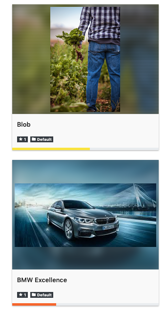
One of the ways to solve it is to add the blur around the image.
This is how it can be done using the ::after and ::before CSS techniques.
This is the end result
Here is code snippet for same:
<style>
.card-crop:before, .card-crop::after {
    content: " ";
    background-image: inherit;
    background-position: center !important;
    background-repeat: no-repeat !important;
    height: inherit;
    width: inherit;
}
.card-crop::before {
    background-size: cover !important;
    opacity: 0.6;
    filter: blur(8px);
}
.card-crop::after {
    background-size: contain !important;
    background-origin: content-box;
    padding: 5px;
}
.inline-block, .inline-block:before, .inline-block:after {
  display: inline-block;
  height: 225px;
  left: 0;
  right: 0;
  top: 0;
  bottom: 0;
}
.card-crop {
  background-color: #ffffff;
  border-bottom: 1px solid #efefef;
  border-bottom: 1px solid #efefef;
  background-position: -1px -1px;
  background-size: 1px;
}
.inline-block:after {
  position: absolute;
}
</style>
<div class="card-crop inline-block"  style="background-image: url('/images/Blog/car.jpg'); height: 225px; width: 300px; display: flex; flex-direction: column; position:relative">
</div>